Some West Ham fans won’t like watching them play away in 2015-16
Published: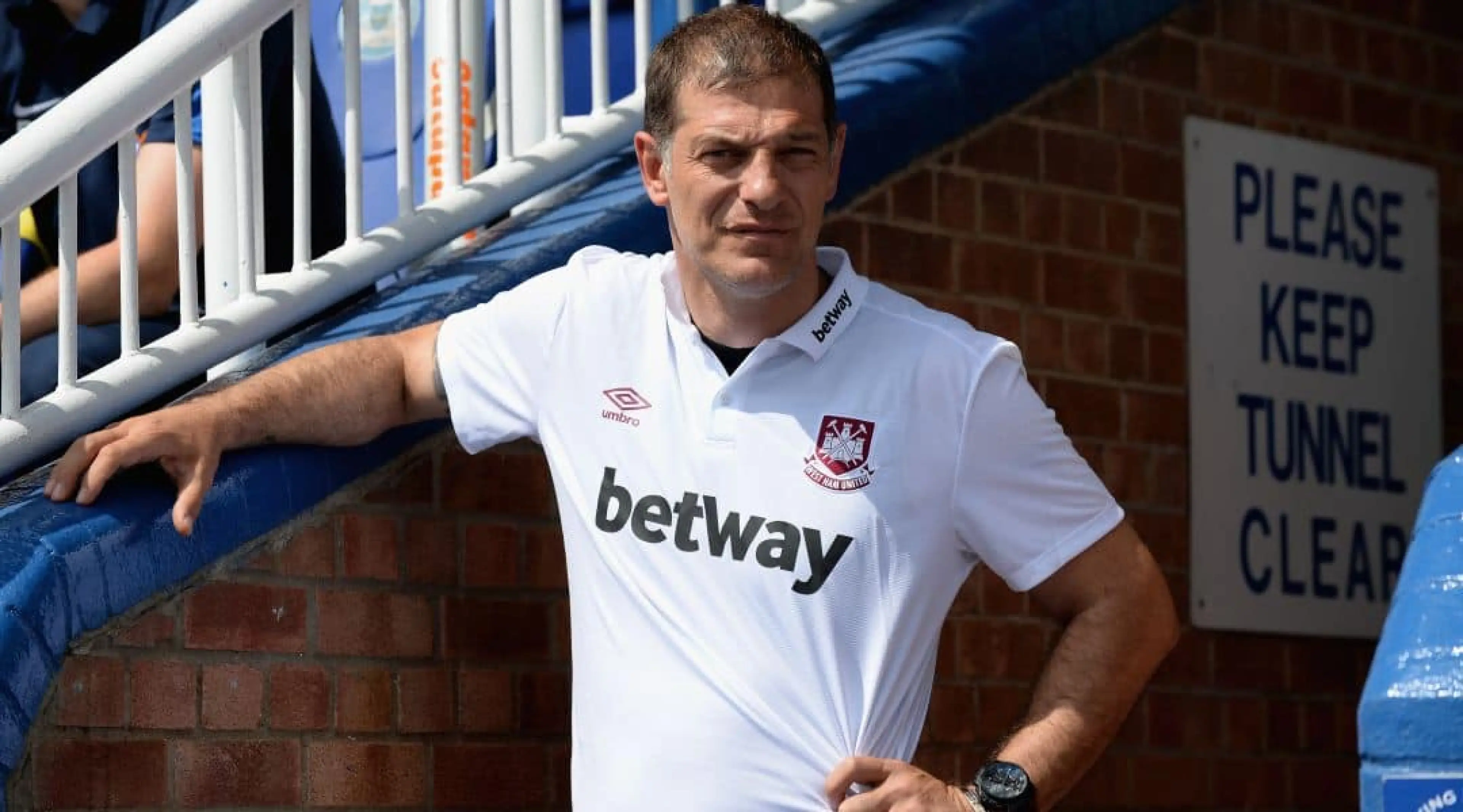
Transfer speculation and a lack of signings won’t be the only thing getting fans in a twist in the coming weeks.
As the season creeps every nearer, many clubs are gradually releasing their kits for the campaign ahead.
And having released a new home kit to a very positive reaction last month, West Ham today showed off their brand new away strip in an video featuring new signing Dimitri Payet donning his new ‘armour’.
The kit is designed to be a throwback to the very first years of West Ham United, to mark the final season that the club will be calling the Boleyn Ground their home.
The new away shirt is roughly based on one of the first Claret & Blue kits, worn from 1901-03 #WHUFC pic.twitter.com/02WtRwNRoU
— The Irons Circle (@TheIronsCircle) July 15, 2015
We’ve taken a look around the Twittersphere and it seems that while the first choice colours went down a storm amongst the Irons fanbase, the change strip has met with a very mixed reaction. Some were delighted…
West Ham away kit is as good as their home. Absolutely top drawer. Love a retro design! #WHUFC — Gary Dabbs (@SaintDabbsie) July 15, 2015
#WHUFC have absolutely knocked it out of the park when it comes to the designs of both kits. Home and Away look simply stunning.
— Mitch Waddon (@MitchWaddon) July 15, 2015
Others offered a very contrasting view…
@whufc_official @umbro that is definitely one of the worse kits I have seen in a while. #whufc #coyi — IMRANO (@1mrano) July 15, 2015
The throwback design had some clambering to praise the return to a horizontal stripe from a diagonal belt that had graced recent campaigns…
I love the new #WHUFC away kit. I’m glad it doesn’t feature a “seat belt” anymore 🙂
— Slavomír_S (@slavsl) July 15, 2015
But it was the differing nature in the top and bottom that left many questioning the choice of claret pinstripes and the decision for the club crest to blend in to the blue body.
Under the @whufc_official crest, white lettering marks the 112years spent at the Boleyn Ground pic.twitter.com/GHuSE2N4zl — Umbro (@umbro) July 15, 2015
@whufc_official @umbro ah it was so near in being a quality shirt, what is up with the diagonal claret lines? Would be been better without
— Adam (@ArchiAAL) July 15, 2015
That new #whufc away shirt needs a gold crest. — Daniel Prescott (@DanielDPrescott) July 15, 2015
For some though it may have been more suited to Cheltenham or Ascot than Upton Park…
Are new away kit looks a bit like a jockys top espesh with long sleeves but were west ham so it looks good 🙂 #whufc #coyi
— ⚒ mark russell ⚒ (@markrussell09) July 15, 2015
What do you think of the Hammers’ new away offering? Have you say in the comments box below.
All Odds and Markets are correct as of the date of publishing.
Fancy a flutter? Sign up today to claim up to £25 in free bets.


